What changed
10M+
Downloads on the Play Store
4★
Average rating across those installs
2 → 1
Two mental models folded into one home screen
The problem
Two products, two mental models, one app icon.
The personal finance side of Axio had a loyal base. The buy-now-pay-later side, recently acquired from Walnut, ran on its own disconnected logic, with its own navigation and its own visual language. Customers were using both halves, and the app did not know it.
Anyone who wanted to check their budget and use their credit line in the same session had to context switch as though they had opened two different apps. The brief was not to bolt one product onto the other. It was to build one financial home screen that happened to contain both.
How I knew
Two people, four themes, and every one of them pointed at a decision.
Before any of that I ran sessions with engineering, product and marketing, to find out what the credit logic could and could not be changed to do, what compliance required, and what marketing needed visible on the home screen. That is unglamorous and it is the reason this shipped rather than staying a beautiful file.
Then I ran supervised sessions with existing Axio users to understand how they actually used both halves of the app, and where they got stuck switching between them. Two patterns came up again and again: people wanted to see how a purchase would land on their month before confirming it, and nobody trusted a credit score they could not see the logic behind.
Rohit Arora
28 · Marketing executive
Wants
To use pay later for big purchases without losing track of his monthly budget.
Stuck on
Could not see how a pending repayment would affect his available spending.
Brijesh Sharma
34 · Small business owner
Wants
Credit access without surprise fees, while tracking irregular income closely.
Stuck on
Did not trust the terms, because the app never explained how limits were set.
-
Theme 01 · Budget visibility
“Couldn't see how a purchase would affect monthly budget”
“Wants to use pay later without losing track of spending”
Show budget impact inline, before the purchase confirms
-
Theme 02 · Trust in credit logic
“Didn't trust the terms, felt like a black box”
“App never explained how credit limits were set”
Make the limit's logic visible, not just the number
-
Theme 03 · Context switching friction
“Budgeting and borrowing felt like two separate apps”
“No shared navigation between the two halves”
Treat credit as a feature of your finances, not a destination
-
Theme 04 · Income volatility
“Irregular income makes fixed repayment terms feel risky”
“Wants credit access without surprise fees”
Surface fees and terms upfront, not after commitment
I grouped what came out of those sessions into an affinity map, sorting individual complaints into themes rather than treating each one as a one-off. Four themes emerged, and each one turned into a specific decision further down this page.
Decision 01
Credit became a feature of your money, not a destination.
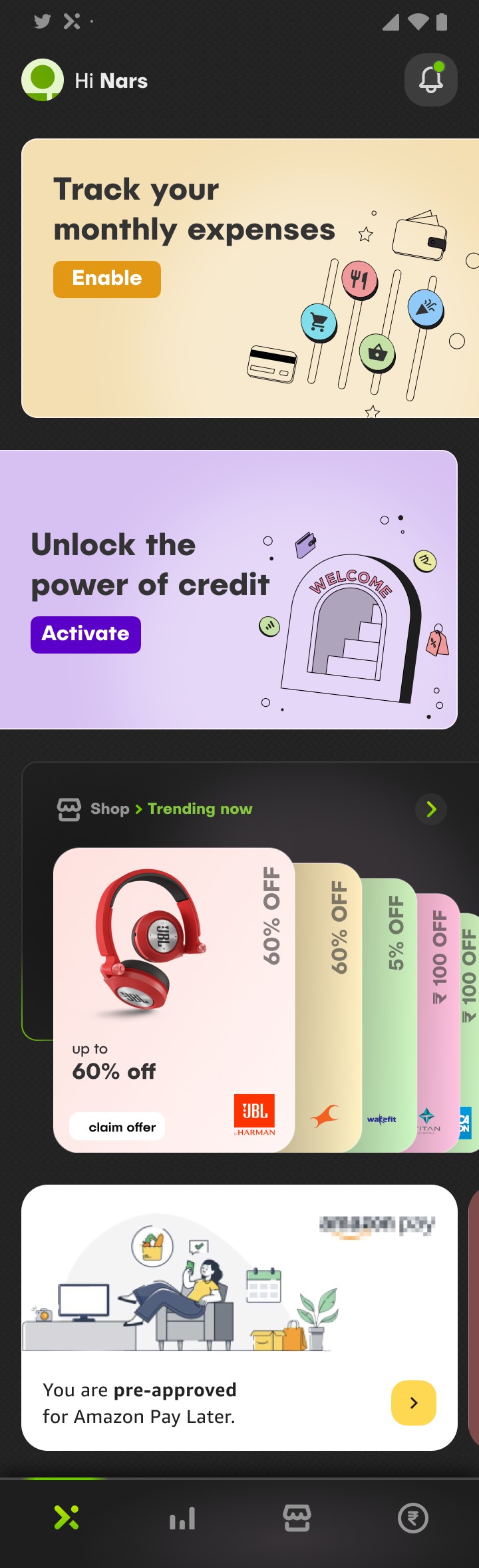
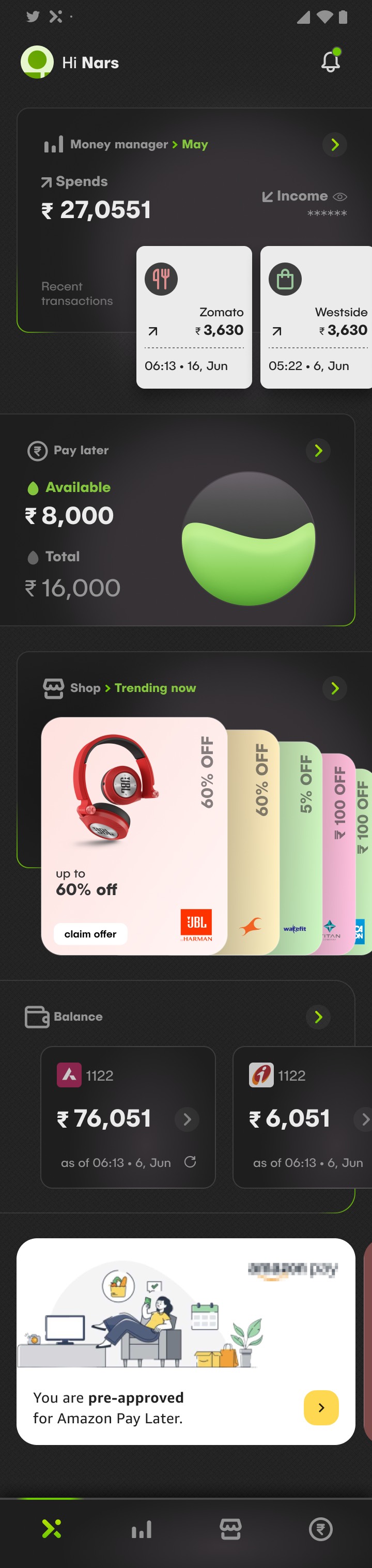
I restructured the app around four honest jobs: budget visibility on the home screen, spend tracking inside personal finance, partner offers in the catalogue, and credit grouped on its own. Where two pillars overlapped they cross-linked rather than duplicating screens, so there was only ever one place a thing lived.
The clearest evidence is the home screen itself. Budgeting and credit sit on it together. Before you have activated credit it appears as an invitation beside your expenses rather than as another tab to go and find, and once it is on, your spending and your available limit are the same view.
In supervised sessions with existing users the same thing kept surfacing: people wanted to see how a purchase would land on their month before they confirmed it. That is not a separate destination you navigate to. That is the home screen.
ScreenActionCross-link
Home
- Permission prompt locked state
- Grant permission
- Money manager set budget, view transactions
- Reminders upcoming bills
- Catalogue offers
Personal finance
- Overall stats spend and income this month
- Recent transactions by merchant and category
- View income hidden by default
Catalogue
- Shop and partner offers
- Categories electronics, fashion
- Brand collaborations featured listing
- Claim offer
Credit
- Pay later, Amazon, loans sibling tabs, one pattern
- Credit limit available against total
- Recent purchases instalment breakdown
- View catalogue
Decision 02
Show what a purchase does to your month, before it is confirmed.
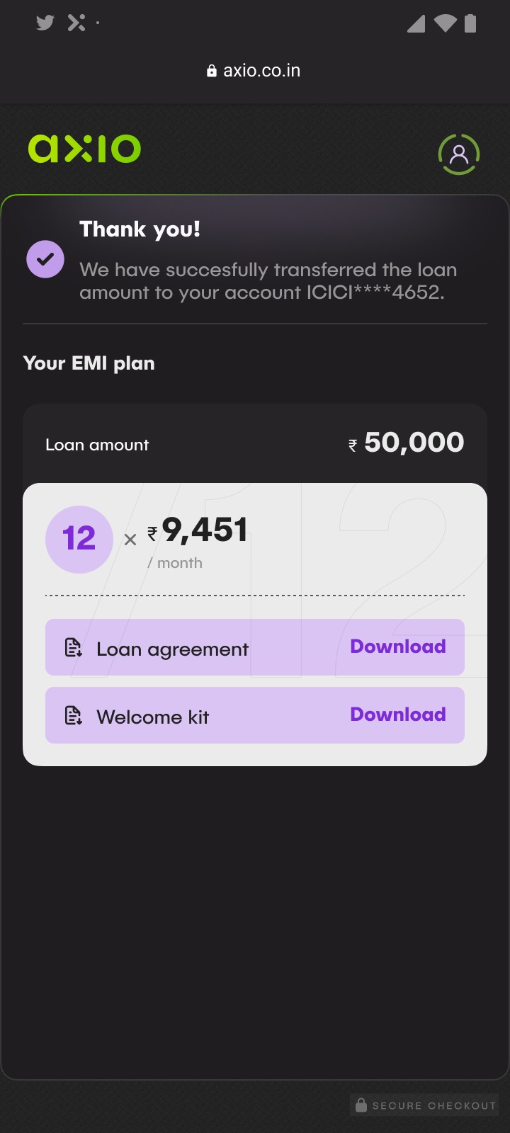
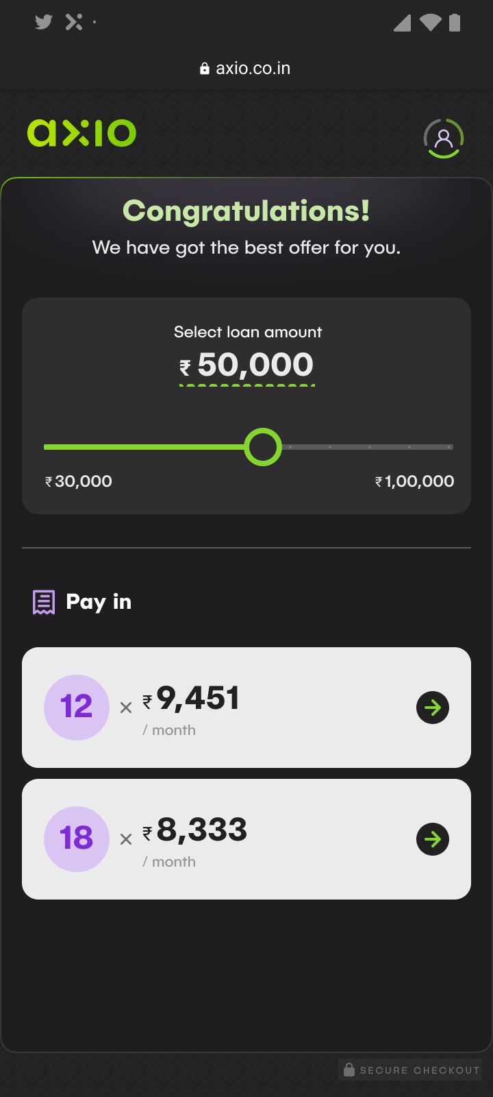
Every credit decision point carries its monthly consequence with it. Choosing an amount shows the instalment for each tenure right there on the slider, so the question stops being how much can I borrow and becomes how much do I want to owe every month.
The combined data was the whole advantage of merging the two products, so it had to show up at the moment of the decision rather than in a statement afterwards.
Decision 03
Make the limit's logic visible, not just the number.
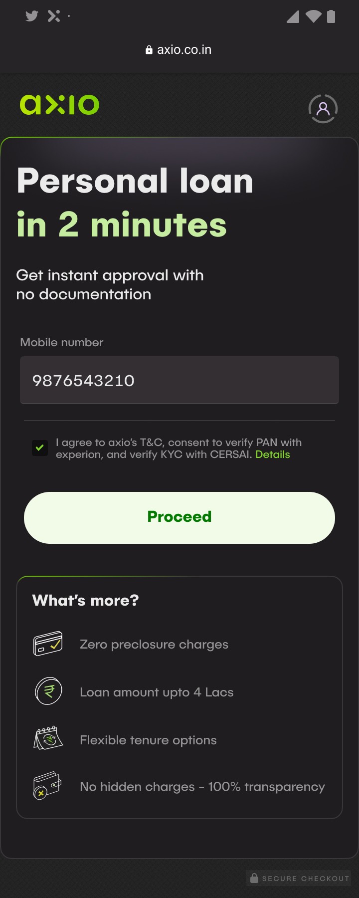
The second theme out of research was trust. People did not believe a credit limit they could not see the reasoning behind, and they read unexplained terms as a black box. So the terms moved ahead of commitment instead of arriving after it: no disclosure charges, the ceiling, the tenure options and the absence of hidden fees, all stated on the first screen.
The score itself gets the same treatment. It is shown with the bank statements it was drawn from, so the number has visible working rather than arriving as a verdict.
One interviewee tracked irregular income closely and wanted credit without surprise fees. Another simply did not trust terms the app never explained. Both objections are answered by disclosure, not by design polish.

Decision 04
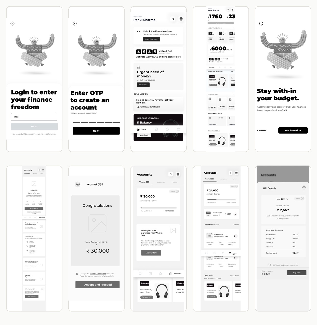
Test in grey boxes, before any of it looks finished.
I ran task based usability sessions on the low fidelity prototype before visual design started. 80% set up a monthly budget in two to three minutes. 90% added and categorised an expense in about two. 95% called the design easy on the eyes, and 70% came back to the prototype more than once, which is a strong early signal.
The one real flag, 10% hitting checkout errors, traced back to payment processing rather than the flow. A build issue to hand over, not a design problem to keep iterating on.
Decision 05
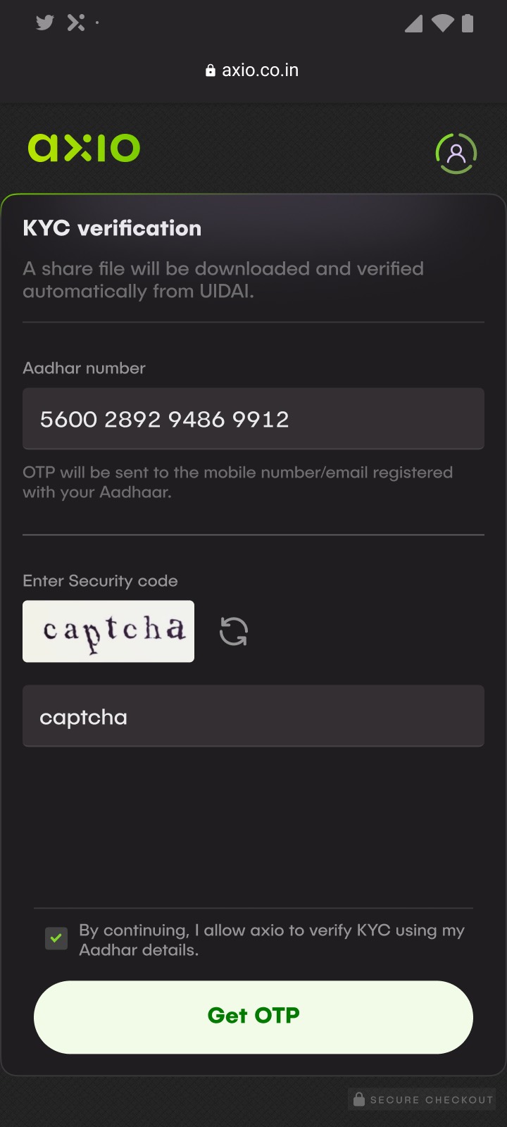
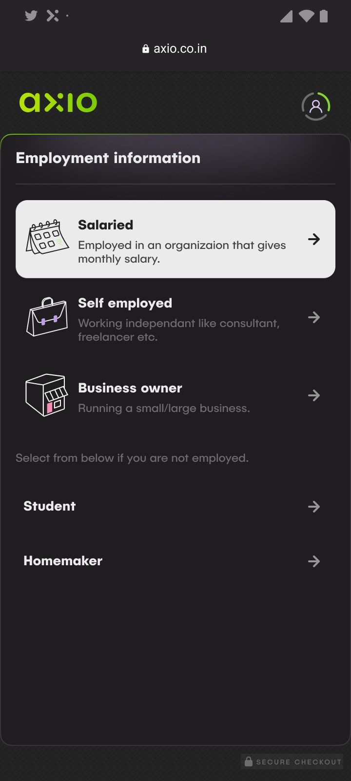
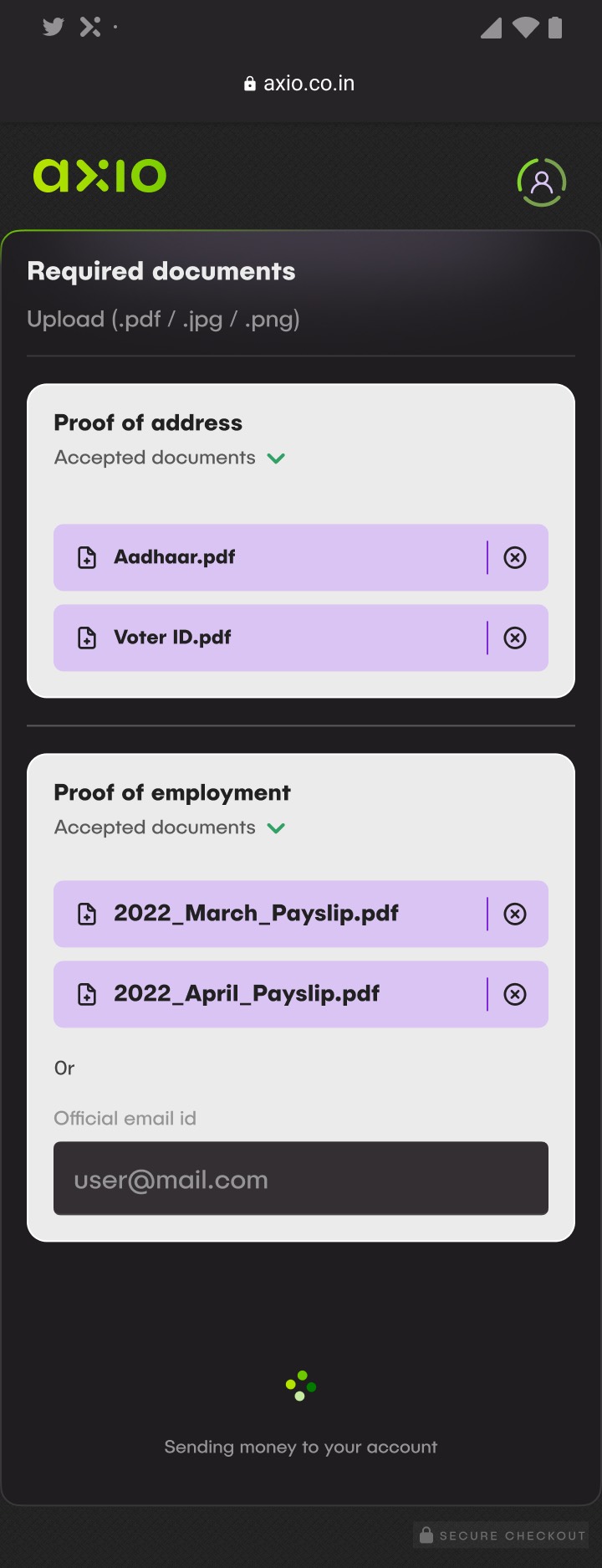
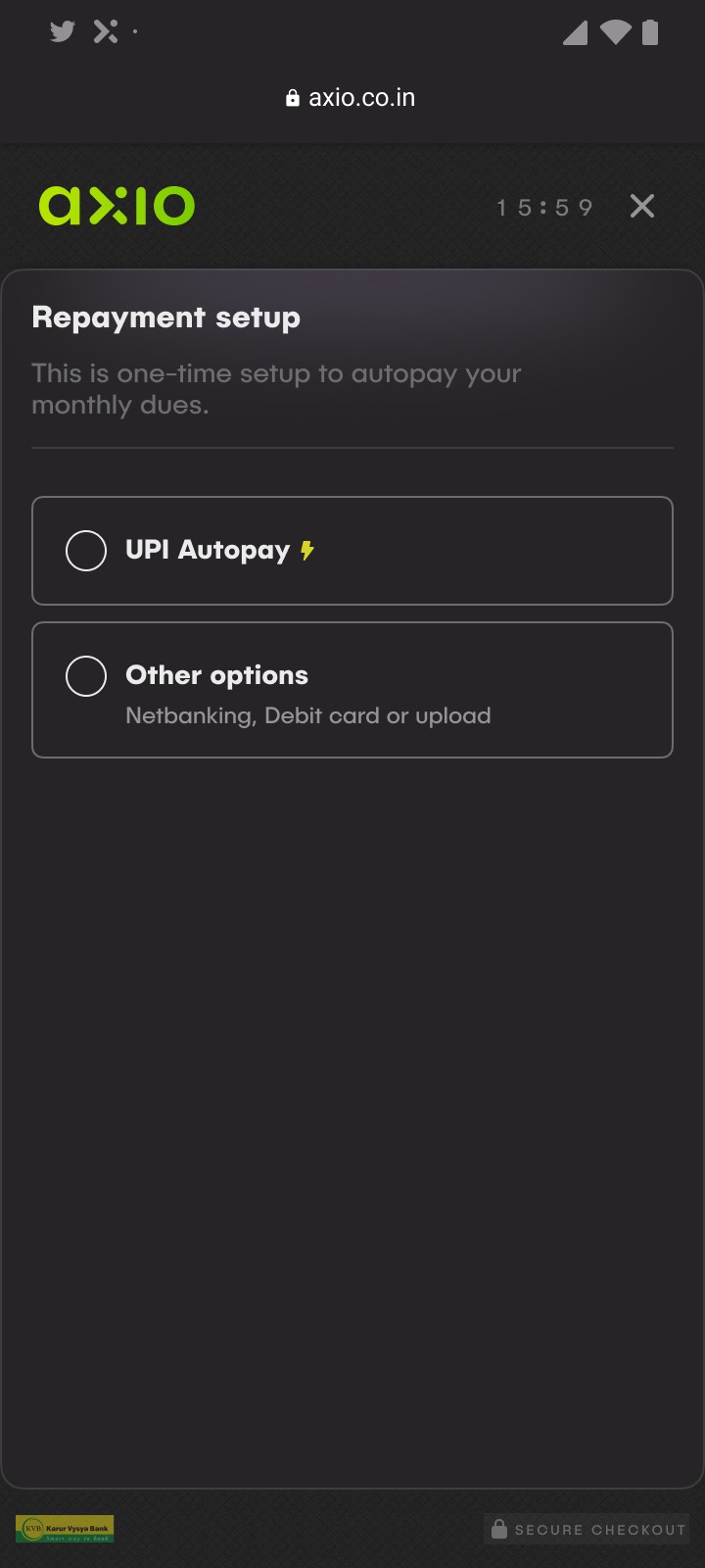
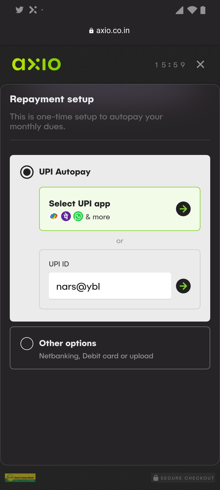
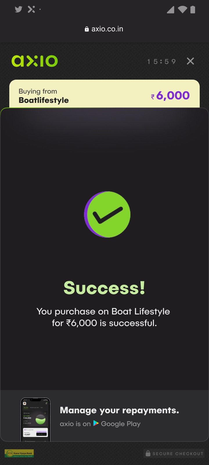
The shipped flow, in the order you meet it.
Terms, identity, employment, documents, score, amount, mandate, money. The same ordering logic throughout: the least frightening question first, nothing sensitive asked before the app has earned it.
What I took from it
It is tempting to redesign everything when you are handed the access. The moves that mattered most here were the smallest ones: surfacing budget impact at the exact moment of a credit decision, and leaving alone the screens nobody was confused by. Good research tells you where not to spend your time as much as where to spend it.