What changed
85%
Fewer applicants dropping out of the flow
0 → 1
Built from a blank canvas to a shipped product
3
Trust zones the whole flow is ordered by
The problem
There was nothing to redesign.
Protium Finance lends to micro, small and medium businesses across India, the kind that cannot get fast, flexible capital from a traditional bank. This was greenfield. No existing flow, no screens, no precedent.
So the challenge was not fixing bad interface. It was deciding what the flow should be at all: how many steps, what to ask for, and when. For a first time borrower every extra field is a reason to close the tab, and this process is inherently about risk and paperwork. It had to earn each question it asked.
How I knew
Nothing to anchor against, so I went and asked.
With no existing flow to critique, the only way in was the people who would use it. I interviewed target borrowers about what they actually own, use and worry about financially, rather than what a typical loan form assumes about them. Two came back clearly, and both were wary of anything that behaved like a black box.
Anand Kumar
Small business owner
Wants
Quick access to capital without juggling paperwork across several lenders.
Stuck on
Distrusts apps that ask for sensitive financial details before explaining why.
Dhriti Sharma
First time borrower
Wants
A flow that explains its terms in plain language rather than legal copy.
Stuck on
Has abandoned other loan applications mid-flow at confusing eligibility checks.
-
Theme 01 · Trust before disclosure
“Distrusts apps that ask for sensitive details before explaining why”
“Explain the terms in plain language, not legal copy”
Earn each question before asking it, and say why it is needed
-
Theme 02 · Paperwork friction
“Juggling paperwork across multiple lenders”
“Every extra field is a reason to close the tab”
Ask for the least sensitive thing first, the hardest thing last
-
Theme 03 · Pace and dead ends
“Abandoned other loan apps after hitting confusing eligibility checks”
A failed check returns you to the field, it never ends the application
Clustering what they said produced three recurring pressures. Each one is the reason for a decision below, and together they are why the flow is ordered the way it is rather than the way a lending back office would naturally ask for things.
Decision 01
Order the flow by how frightening each question is.
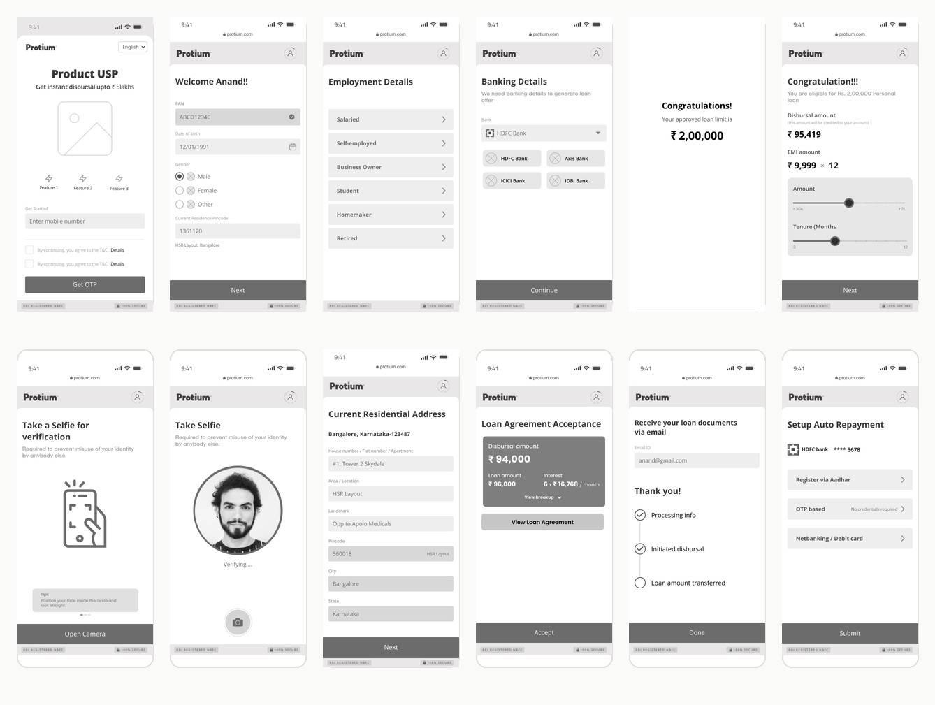
I grouped the research into affinity clusters, trust signals, paperwork friction and pace, and used that to set the order of the whole application across three zones of increasing sensitivity. Asking for sensitive information too early was the single biggest predictor of drop-off in the interviews, so nothing sensitive appears until the flow has earned it.
Both borrowers I interviewed said the same thing in different words. One distrusted apps that ask for financial details before explaining why. The other had already abandoned loan applications after hitting confusing eligibility checks. Neither of those is a visual problem, and no amount of polish answers them.
- Landing phone number
- Enter PAN
- Validating retry on fail
- Aadhaar KYC OTP
- Employment details
- Banking details
- Disbursal account penny drop
- Amount and tenure sliders
- Selfie verification liveness
- Loan agreement
- Amount transferred confirmation
Decision 02
A failed check loops back. It never dead-ends.
The validation step after PAN entry is a real decision point rather than a screen. A failed check returns the applicant to the field with a way forward, because a dead end this early is an abandoned application and a customer who does not come back.
Decision 03
Design the waiting, especially where trust is thinnest.
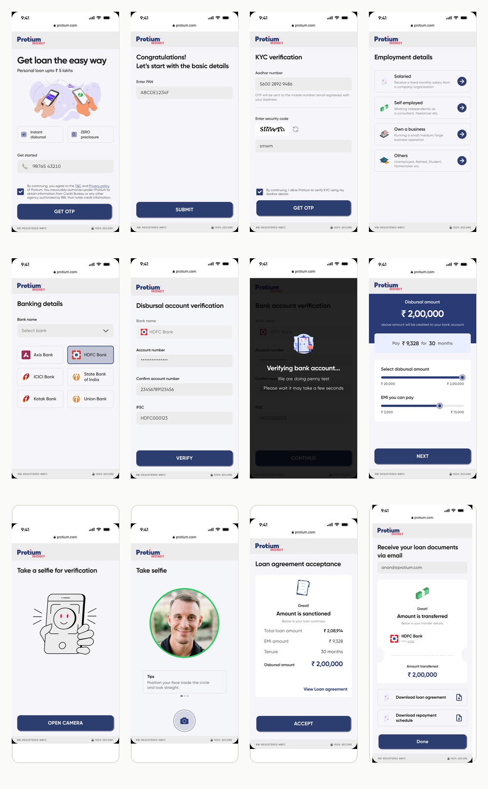
The bank verification penny drop was drawn deliberately rather than left as a generic spinner. It is the moment the flow asks for the most and shows the least, so it is exactly where a blank screen costs you the application.
The final interface follows Protium's navy and coral, with custom illustration replacing the wireframe placeholders, and keeps every screen focused on one decision at a time. It reads less like a bank form and more like a guided checklist.
What I took from it
The clearest validation was not the visual polish. It was that the order of questions, decided before a single screen was drawn, turned out to be the thing that moved the number.