This was a proof of concept prepared for TVS Motor, not a shipped product. There are no download counts or drop-off rates for it and I am not going to invent any. What it delivered was a structural diagnosis and a direction specific enough to brief a build team against.
What changed
4 → 1
A sprawling feature list distilled into one navigation model
4
Competitor apps benchmarked against the existing product
3
Rider archetypes used to pressure test the new structure
The problem
All the pieces existed. They just did not feel like one product.
TVS Connect is the companion app for TVS's connected motorcycles and scooters. It pairs with the bike to show live vehicle data, service reminders, navigation and a rider community. Every one of those things was already in there.
The brief was to propose a clearer structure: audit what existed, look at what competitors were doing, and recommend a direction. A pitch, not a build, which meant the argument had to carry itself on evidence rather than on mockups.
Decision 01
The problem was not four bad screens. It was one missing structure.
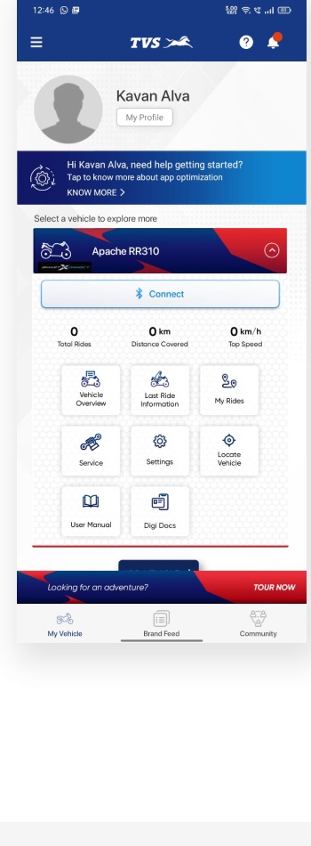
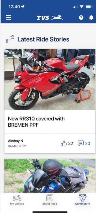
I audited the live app screen by screen, dashboard, vehicle overview, navigation and community, scoring each against usability fundamentals. The same faults kept reappearing in different costumes, which is the tell that you are looking at a symptom rather than a cause.
The home screen's information architecture had grown unconventionally, with inconsistent type, card sizes and button styles producing a cluttered hierarchy. Fixing screens individually would have papered over a problem that needed new structure underneath.
What was not working
- No clear order to the information on screen
- The main call to action sat in a banner nobody pressed
- Inconsistent components and arbitrary placement
- Oversized cards, no type hierarchy, wasted space
- The community felt empty, so nothing invited anyone in
What I proposed instead
- Separate subsections so categories are legible
- Contextual actions tied to what the rider is doing
- A real design system, consistency over decoration
- One standard ride overview across every model
- Profiles and photos upfront, plus search and filters
Decision 02
Benchmark it, so the argument is evidence and not taste.
I reviewed four connected vehicle apps against the same two questions: what works, and what is missing. Scoring them the same way meant the recommendation could be argued from the table rather than from taste.
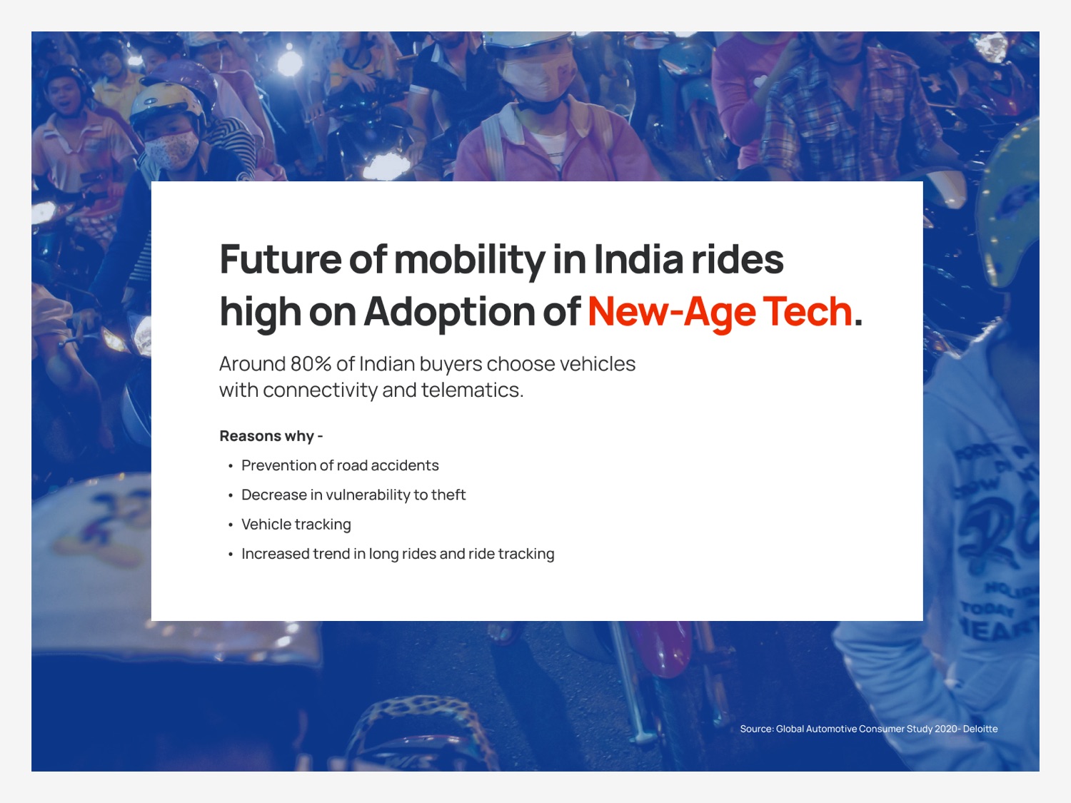
Between them they made the case that connectivity is a purchase driver for two-wheeler buyers in India rather than a nice extra, which is the argument the pitch needed.
Decision 03
Design for three real riders, not one average one.
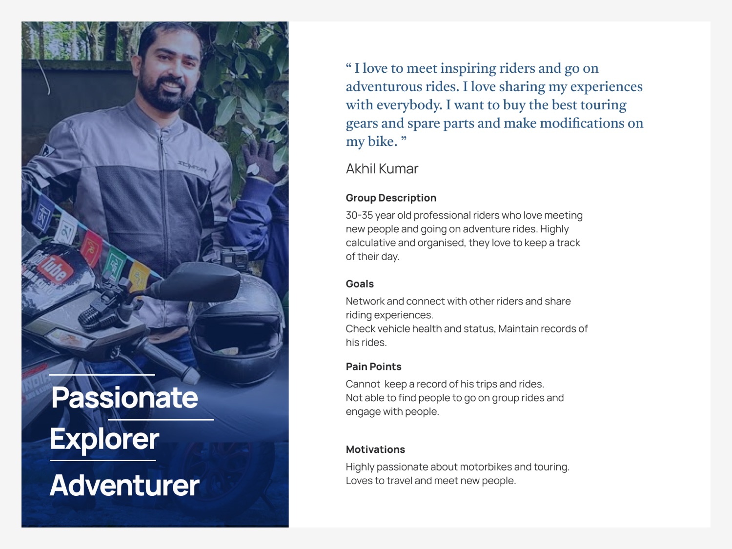
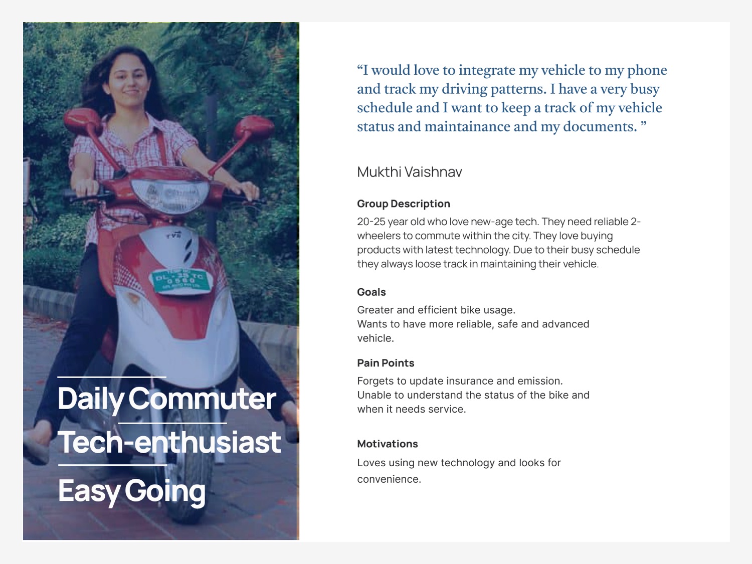
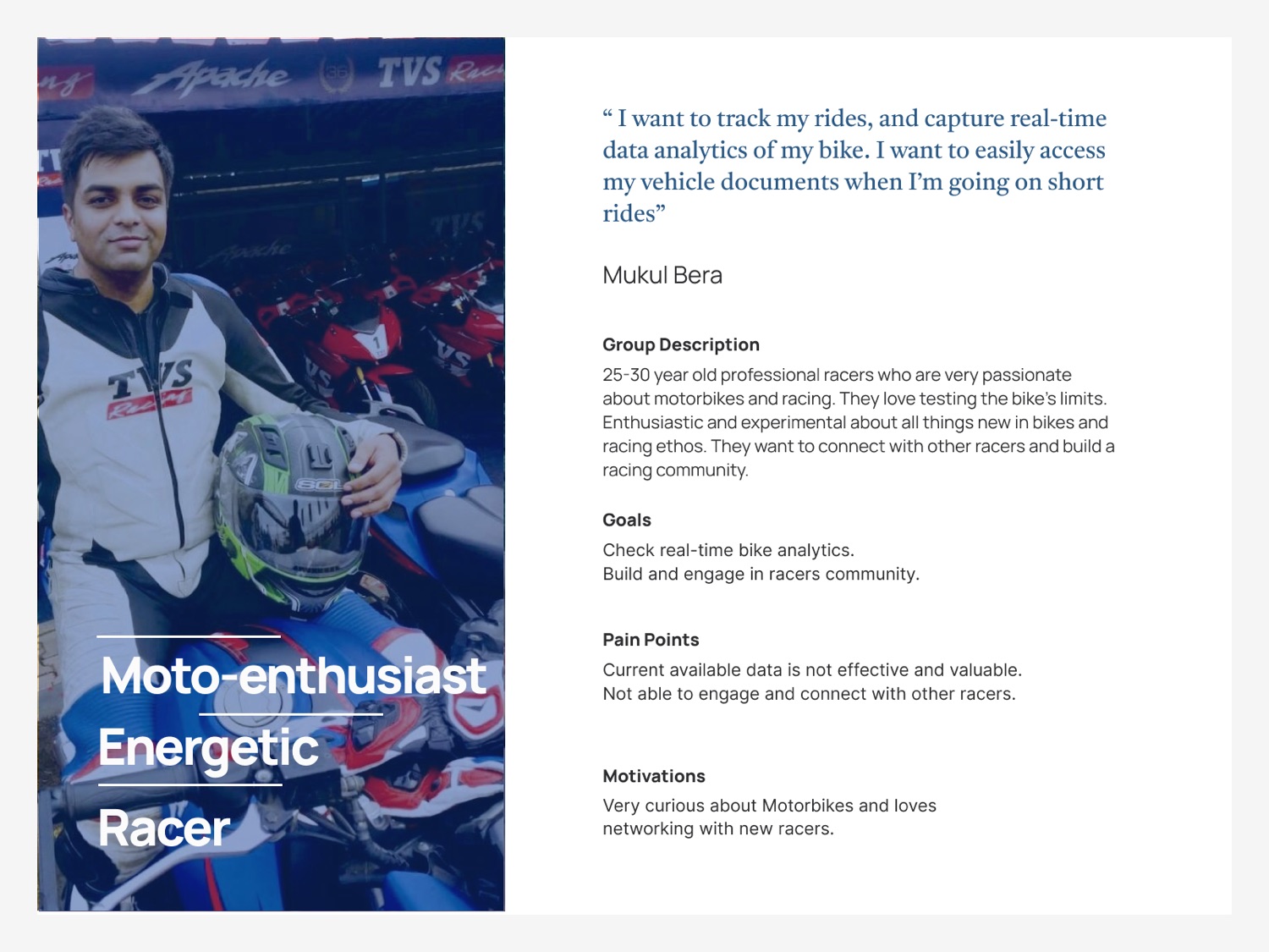
Riders use a connected vehicle app for very different reasons depending on who they are and how they ride. I defined three archetypes from rider interviews and used them to stress test the new structure, rather than designing for an assumed average user who does not exist.
Decision 04
Every pain point sorted into one of four jobs.
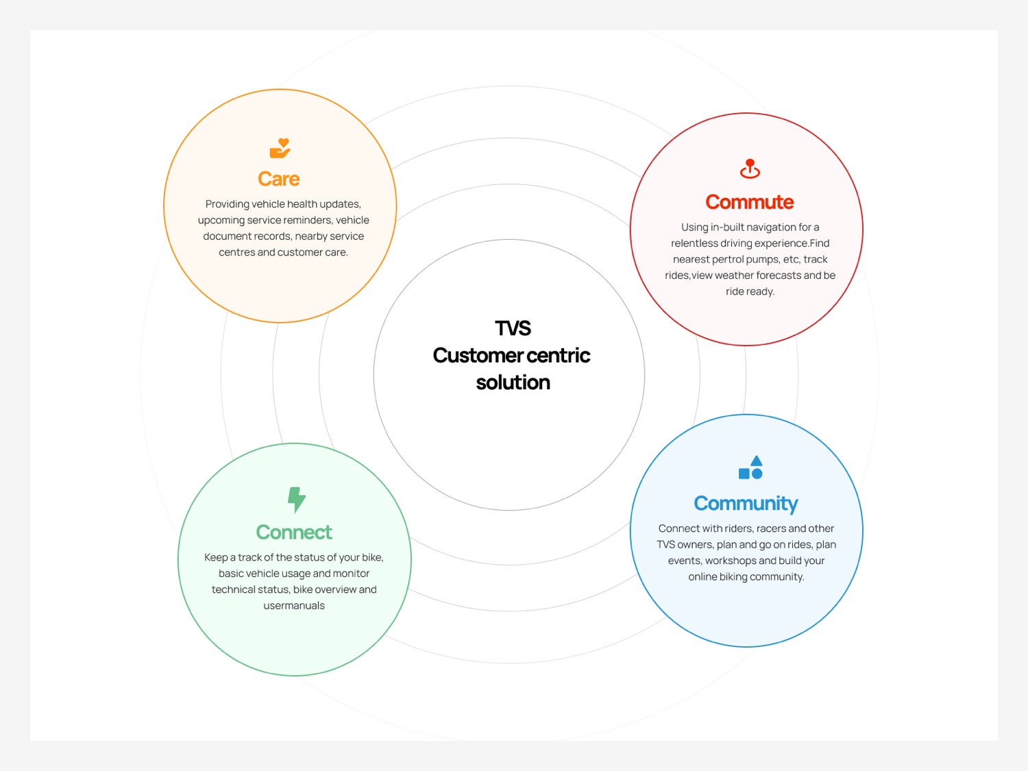
Rather than another flat list of features, I proposed reorganising all of TVS Connect around four pillars, simple enough to become the app's actual navigation instead of a slide in a deck. Every audit finding and every persona need landed in exactly one of them.
Collapsing the feature list into four named pillars meant every future screen had an obvious home. It also gave the rest of the pitch a shared vocabulary. People started saying “that is a Care problem” instead of relitigating where a feature should live.
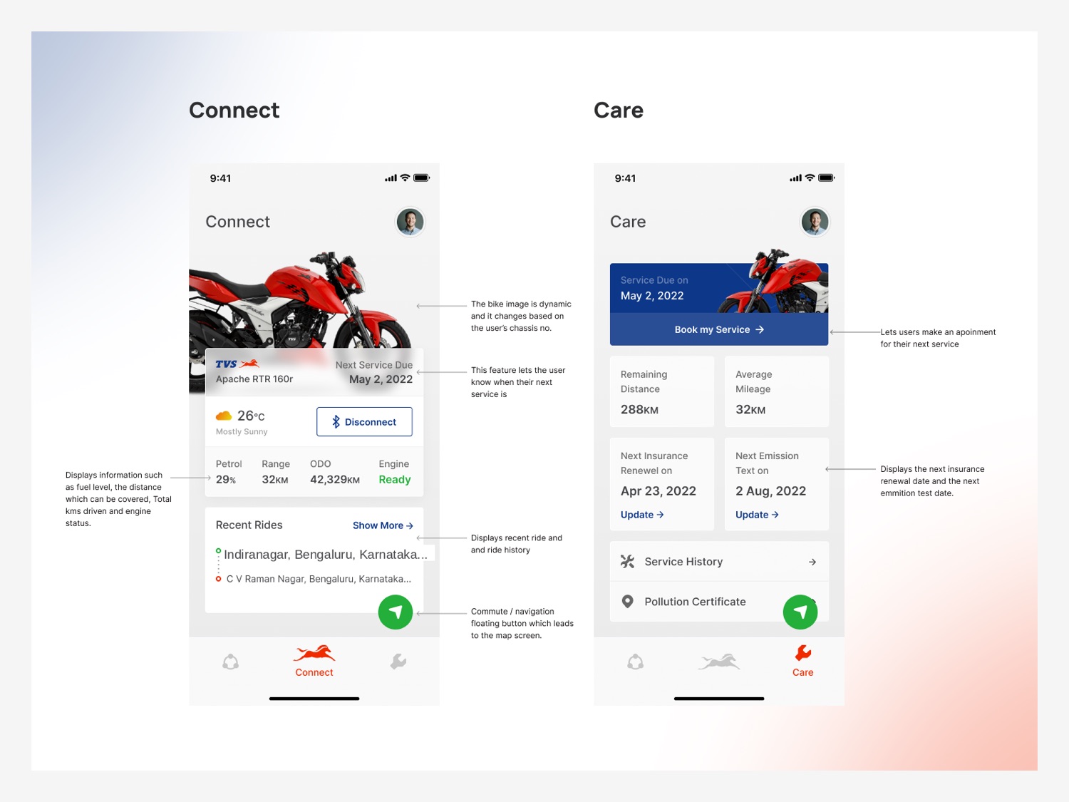
Connect
Bike status in one place: usage, technical health, overview and manuals.
Community
Riders, racers and owners. Rides, events and workshops planned together.
Commute
Navigation built in. Nearby stops, ride tracking, weather and readiness.
Care
Service reminders, health updates, documents and the nearest centre.
Decision 05
Show it on a real screen, not just in a diagram.
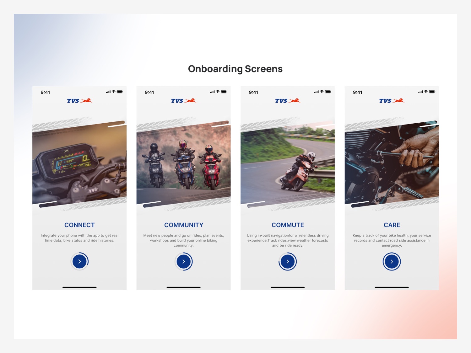
With the structure agreed I designed onboarding that introduces each pillar on first open, then concept screens for two of the four, Connect and Care, so the new architecture could be judged as something that behaves rather than something that argues.
What I took from it
A messy app is rarely four messy screens. It is usually one missing structure wearing four different masks. Naming that structure was worth more to the pitch than any single polished mockup.