What changed
2
Products, a public portal and an internal review tool, on one system
11
Application states, each one colour, used identically everywhere
7 × 5
Input states by field variant, defined before any form was built
The problem
One identity, in two scripts, everywhere it shows up.
Tamkeen is Bahrain's Labour Fund. They needed one visual identity that worked across print collateral, product interface, social and signage, in both Arabic and English, without anyone having to guess which shade of red or which lockup was the right one.
The name shaped the brief. Tamkeen (تمكين) means empowerment, and the identity had to read as confident and direct in both scripts rather than as an English wordmark with an Arabic version bolted on afterwards.
Decision 01
Tokens before components, always.
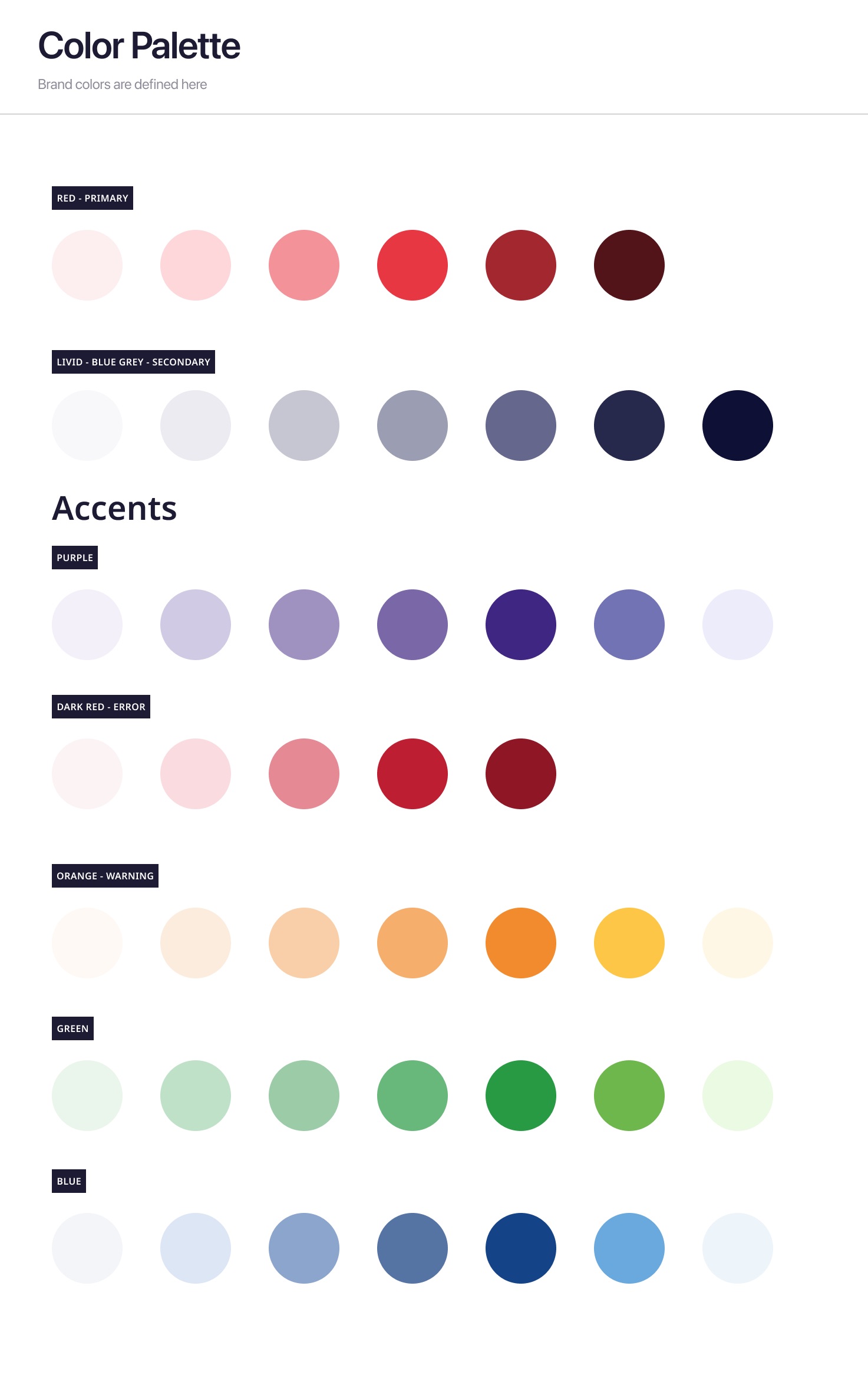
Before any screen got designed, the brand needed exact values: two colours that carry it, a blue tinted grey ramp so neutral interface never reads as flat black and white next to the navy, and four semantic pairs so a warning is always this orange rather than a designer's best guess in the moment.
Every component in this case study inherits its colour directly from those tokens. No new hex value gets introduced at the component layer. That is the actual test of whether a foundations layer worked.
Primary · brand
#E83348
Coral red, carrying the energy of the mark.
Secondary · navy
#172236
Deep navy, carrying the stability underneath it.
Decision 02
Error does not reuse the brand red.
The brand coral and a conventional error red sit close enough together that an early version of the system caused real confusion. People were asking whether a button was broken or just on brand.
Splitting error into its own red, distinct from the brand red, removed that ambiguity before it ever reached a component. It is a small decision that would have been expensive to unpick once forty screens had been built on top of it.
This is the case for doing foundations first in one line. The fix cost nothing at the token layer. At the component layer it would have meant re-auditing every state in the product.
Decision 03
Arabic leads. English supports.
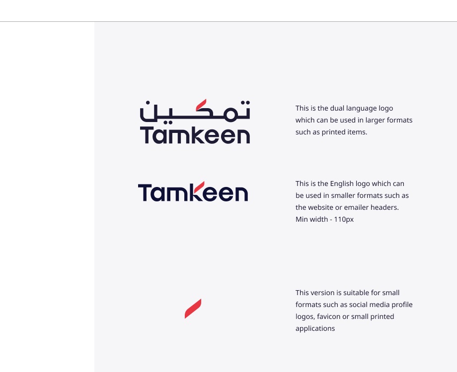
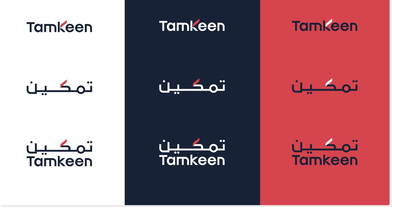
Three lockups, each with a defined job: dual language for print, English only for digital at a 110px minimum width, and icon only for favicons and small social formats. In the dual language lockup Arabic sits above English, reflecting the name's origin rather than treating it as an afterthought translation.
Clear space is defined relative to the mark itself rather than as a fixed pixel value, so the rule still holds whether the logo sits in a footer or fills a billboard. And a logo that only looks right on white is not finished, so both scripts were checked against the full secondary palette before any colour was called final.
Decision 04
Seven states per field, defined before the first form.
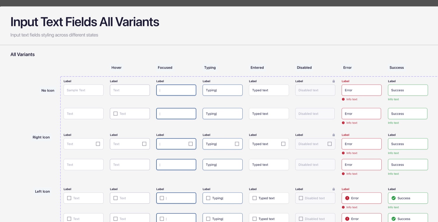
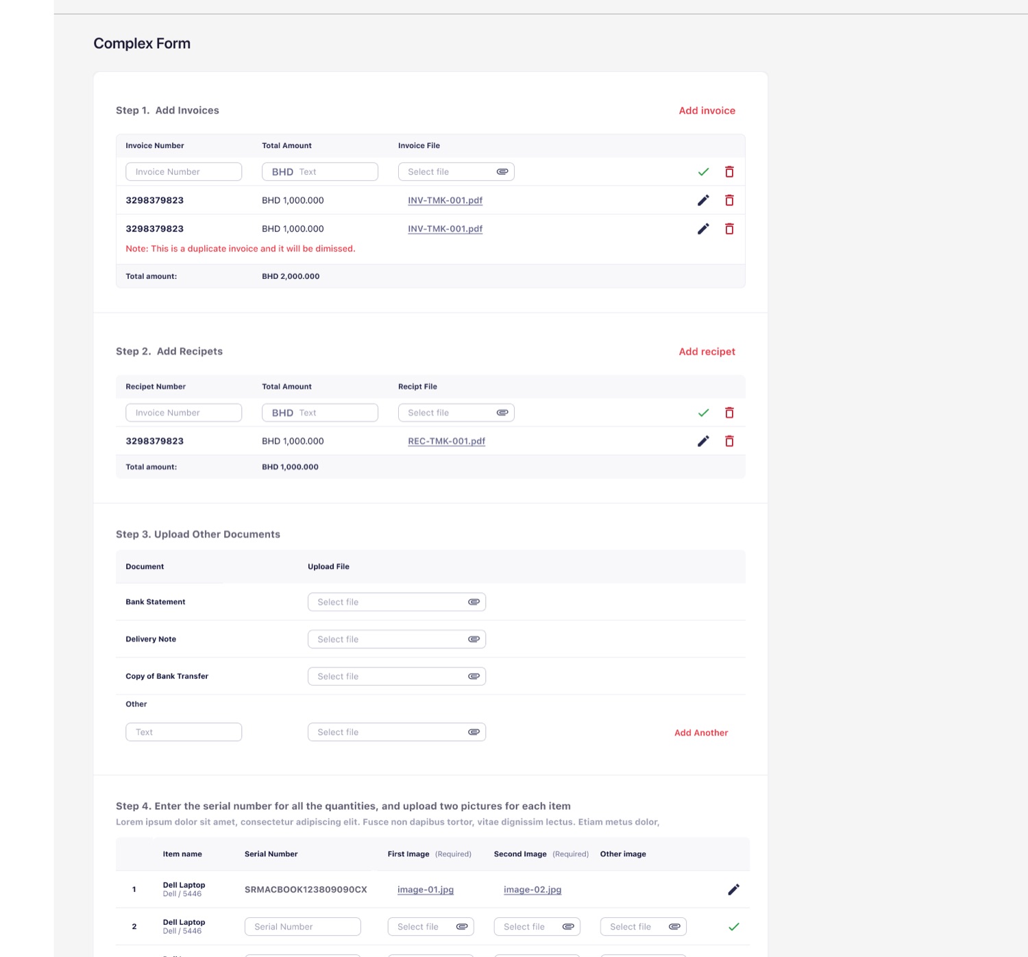
Tamkeen's forms collect sensitive and often legally binding information: IBANs, CPR numbers, commercial registrations. So every field needed its states settled up front, default through hover, focus, typing, entered, disabled, error and success.
Skipping any one of them is how a form ships that looks fine in Figma and breaks the moment a real person mistypes their CPR. Individual fields are only half of it, though. The other half is how rows of fields compose into a shell, so every form in the product became one of a handful of shells with different fields dropped in rather than a bespoke layout per screen.
Decision 05
What a system actually has to contain.
A design system is only as good as the day someone reaches for a component that does not exist yet. So the inventory was built to the edges rather than to the happy path: every state a field can be in, every status an application can hold, every direction a tooltip might need to point.
Buttons · 5
Primary, secondary, outline, ghost, disabled. Each with hover, focus and pressed.
Status badges · 11
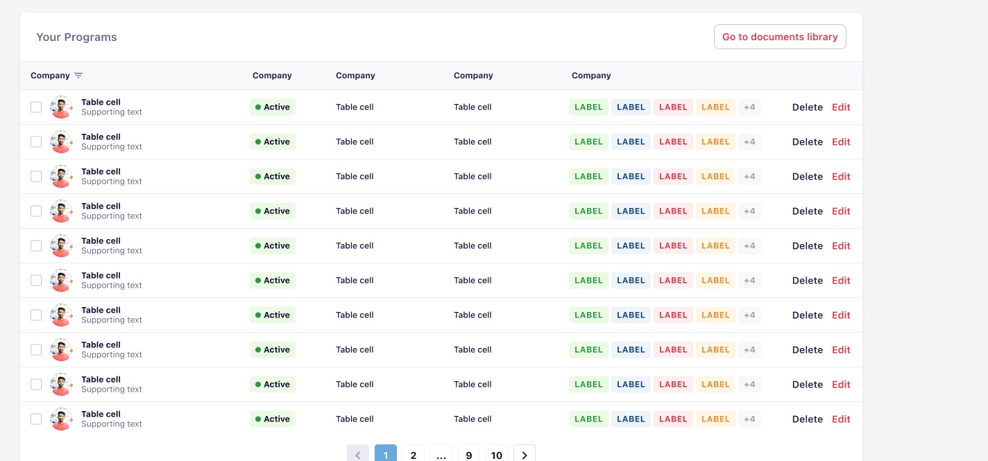
Review, active, pending, rejected, under assessment, withdrawn, not started and four more. Pending is always this orange, in a table row or a full page header.
Input states · 7 × 5
Default, hover, focused, typing, entered, disabled, error and success, across five field variants.
Tooltips · 12
Every arrow position a tooltip might need, so placement near a screen edge is never improvised.
Iconography · 11 categories
Material Symbols, organised by what icons do rather than by what someone might have named them. One licence, one visual language, no custom production to maintain.
Type scale · 6 + 3
Six heading levels stepping by a fixed ratio, three paragraph weights, each tied to a job rather than a size.
Decision 06
Patterns assembled only from pieces that already existed.
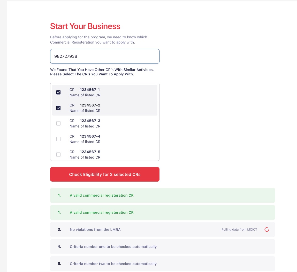
This is where a token set and a component library stop being a library and start being a product. The eligibility check pulls live government data from MOICT and checks violations with the LMRA, and every criterion shows its own state independently so an applicant can see exactly which check is still running.
It is built entirely from checkboxes, status alerts, buttons and a loading icon that were all already defined. Nothing was invented at the last minute to make a specific screen work, which is the only real proof that the foundations held.
Decision 07
Two products, one system, different depth.
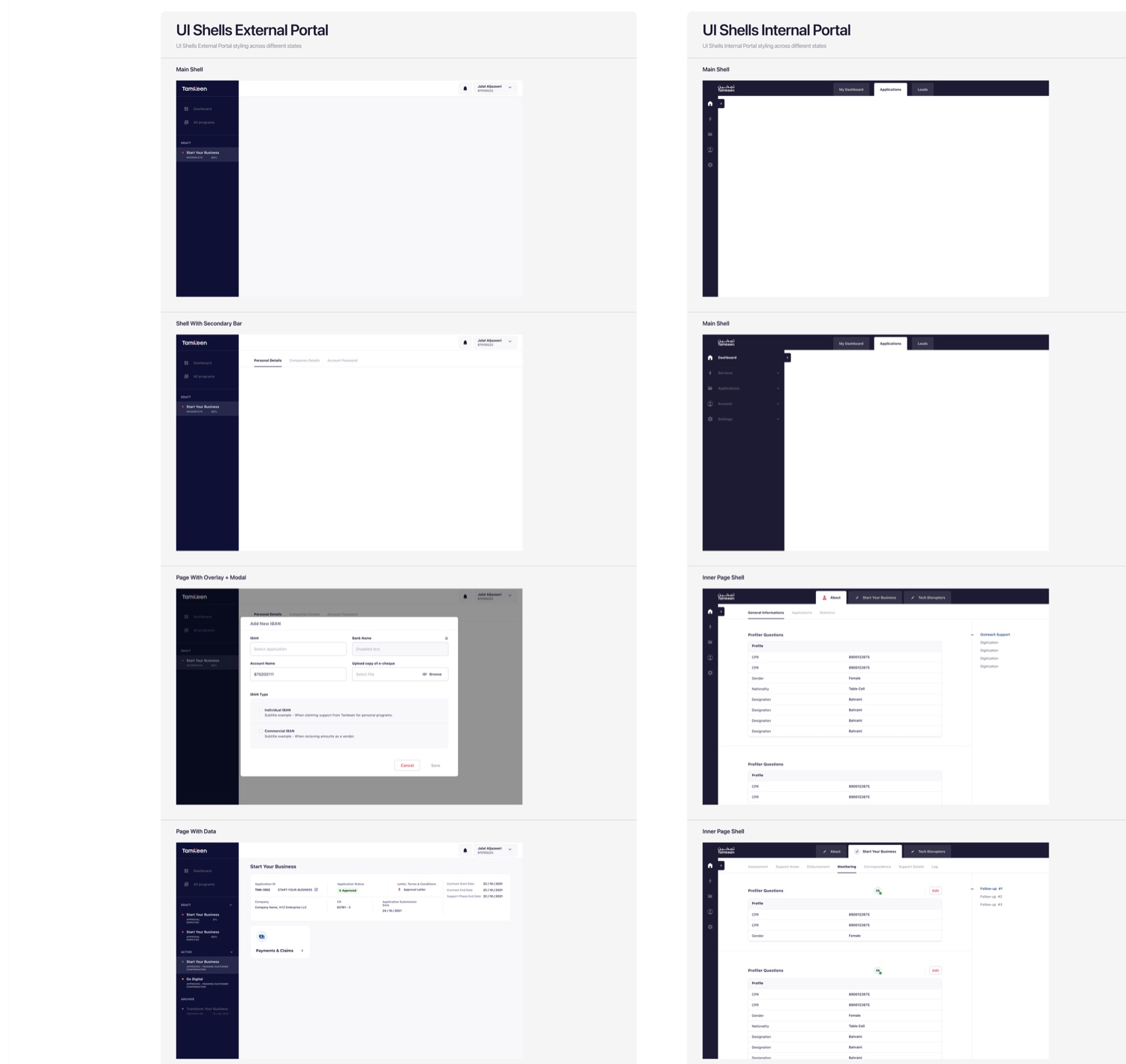
Tamkeen runs as a public portal where businesses apply for programmes, and an internal tool where Tamkeen's own team reviews and approves them. Same tokens, same components, different navigation depth, because the two audiences need different things from a sidebar.
The internal sidebar collapses to icons by default and expands one section at a time. Reviewers handling dozens of applications a day do not want five levels of navigation permanently open. The external shell simply stops three levels shallower.
What I took from it
A design system is not the components. It is the fact that nobody has to ask which red to use, ever again.