
This case study now covers the full system — foundations through components and the patterns built from them. The first seven sections are the tokens (color, type, logo) the rest of the system traces back to; everything after is what got built on top.
01The brief
Tamkeen needed one visual identity that could work everywhere it showed up — print collateral, product UI, social, signage — in both Arabic and English, without anyone having to guess which shade of red or which logo lockup was "the right one." Before any screen got designed, the brand needed tokens: exact colors with exact values, a logo system with explicit rules, and proof that both held up across every context the brand would actually appear in.
The name itself shaped the brief. Tamkeen (تمكين) means empowerment — the identity needed to read as confident and direct in both scripts, not like an English wordmark with an Arabic version bolted on afterward.
02Color tokens
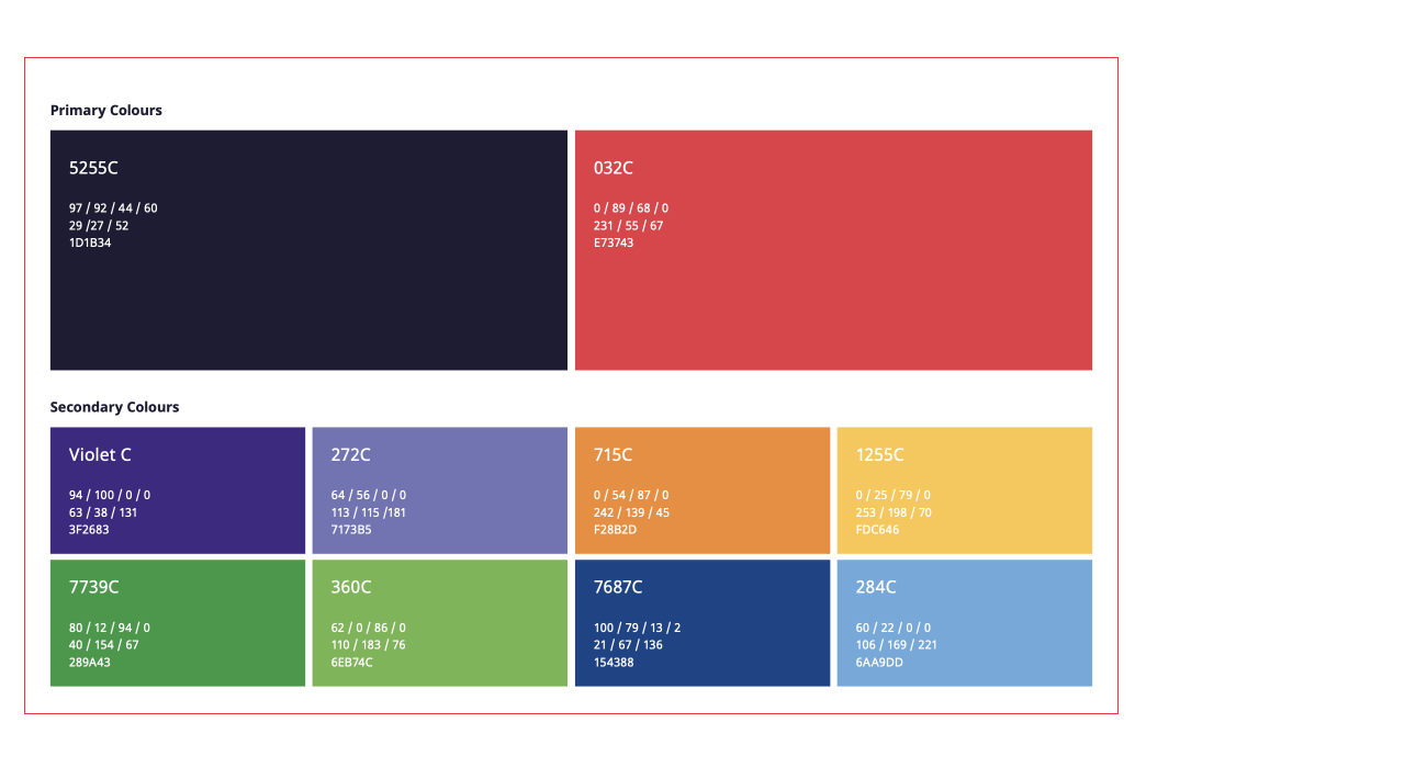
Two colors carry the brand: a coral red for energy and a deep navy for stability. Everything else in the system — greyscale, semantic colors, accents — is built to sit comfortably next to these two without competing with them. Click any swatch to copy its hex.
Greyscale ramp
A blue-tinted grey ramp, tuned so neutral UI never reads as flat black-and-white next to the navy brand color. Hover a step to see its value.
03Semantic colors
Four functional pairs, each a dark/light combination, so status colors stay consistent the moment components get built — a warning is always this orange, never a designer's best guess in the moment.
Error intentionally doesn't reuse the brand coral. The two colors are close enough that an early version of the system caused real confusion — "is this button broken, or just on-brand?" Splitting error into its own red, distinct from the brand red, removed that ambiguity before it ever reached a component.
04Print & production specs
Because Tamkeen's identity needed to travel beyond screens — signage, printed collateral, partner decks — every brand color carries its full spec: Pantone for print houses, CMYK for offset, RGB and hex for everything digital. Nobody downstream has to ask "what red is this" again.
05The logo system
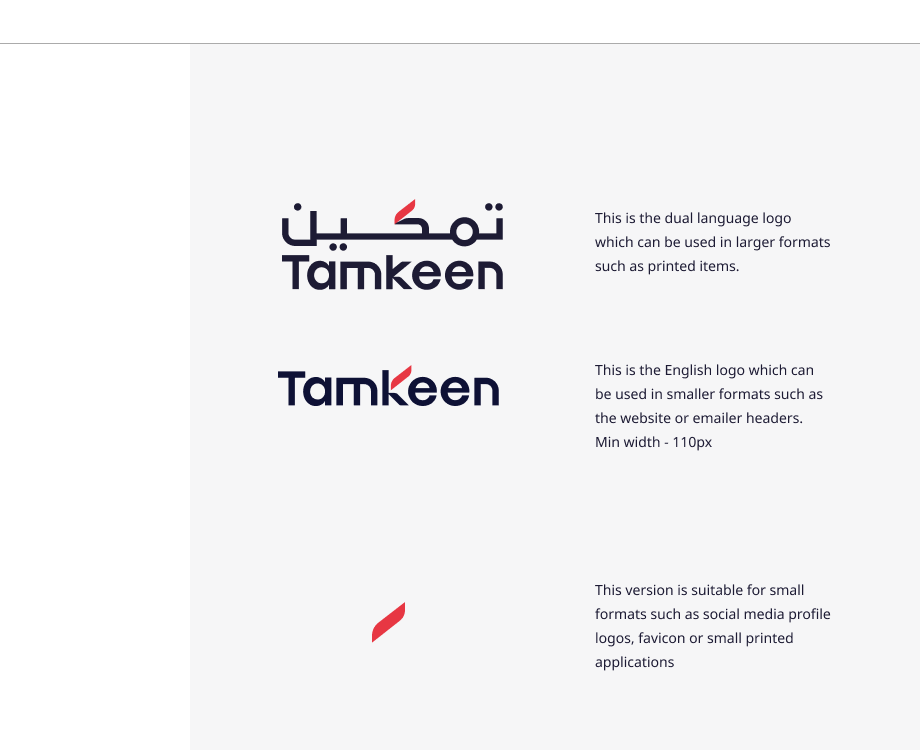
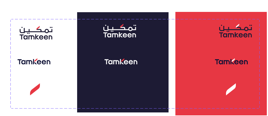
Tamkeen runs as three lockups depending on context, not one logo awkwardly resized. Each has a defined job:
Tested across every background
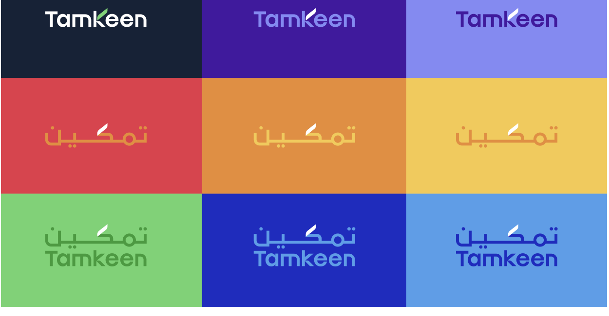
A logo that only looks right on white isn't done. Both scripts were checked against the full secondary palette — eight backgrounds, two languages — before any color was considered final.
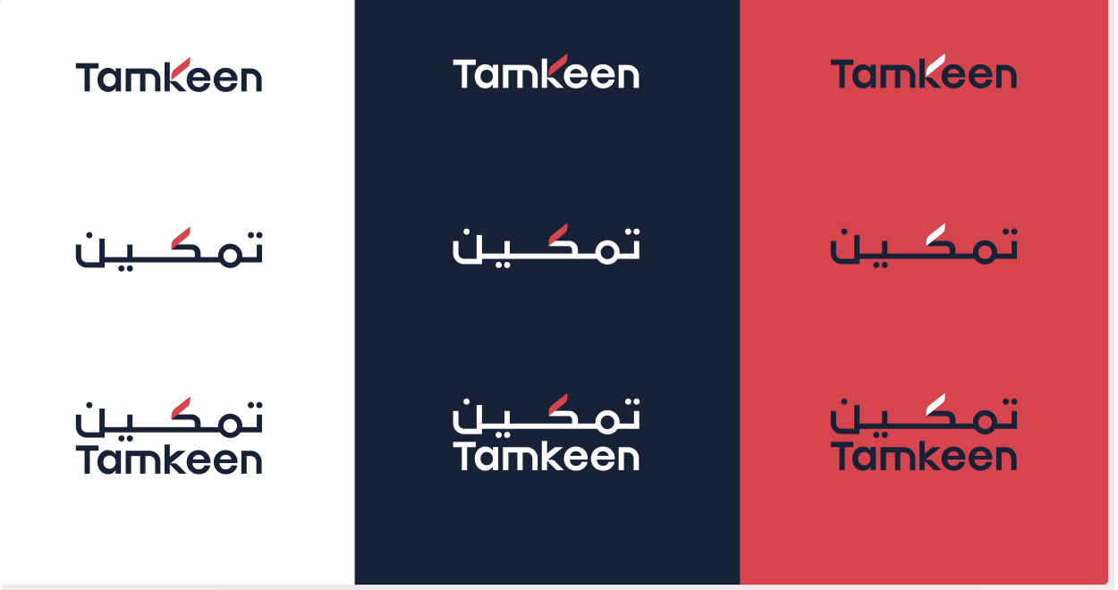
And against the primary palette
06Construction & clear space
Clear space was defined relative to the mark itself, not a fixed pixel value — so the rule still holds whether the logo sits in a footer or fills a billboard.
07Type scale
Six heading levels and three paragraph weights, each with one job. Headings step down by a fixed ratio rather than ad hoc pixel values, so nesting a Heading 4 under a Heading 2 always reads as a subsection — never a guess about which size "feels right" in the moment.
| H1 / 48 | Page titles, once per page |
| H2 / 40 | Main section heading |
| H3 / 32 | Subheading of H2 |
| H4 / 24 | Subheading of H3 |
| H5 / 20 | Subheading of H4 |
| H6 / 18 | Subheading of H5 |
| Paragraph 1 / 16 | Default body copy, regular weight |
| UI Text 1 / 16 | Interface labels, bold weight |
| UI Text 4 / 12 | Caption / overline text |
Each weight is also tied to a job, not just a size — headings are reserved for actual hierarchy, paragraph weights for reading copy, and "UI Text" weights exclusively for interface chrome like labels and buttons. A designer reaching for "Paragraph 2 Bold" instead of "UI Text 2 Bold" for a button label is a 1px difference that's invisible until five different buttons in the same screen don't quite match.
08Iconography
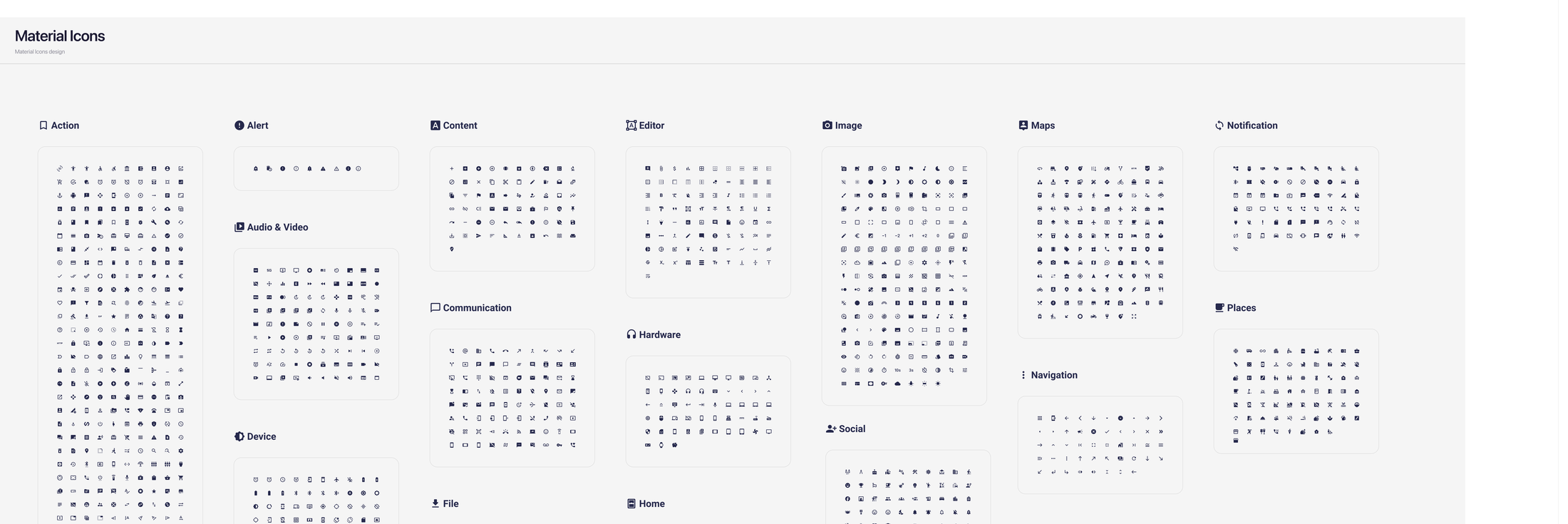
Rather than commissioning a custom icon set the team didn't have time to maintain, Tamkeen standardized on Material Symbols — outlined, consistent stroke weight, and big enough a library that no component would ever need a one-off icon drawn just for it. Organizing them by Material's own categories (Action, Alert, Content, Editor, Image, Maps, Navigation…) made them searchable by what they do, not by guessing what someone might have named them.
09Components
Every component below inherits its colors directly from the tokens already defined — no new hex value gets introduced at the component layer. That's the actual test of whether a foundations layer worked.
Buttons
Status badges
Eleven application states, each one color, used identically whether it shows up in a table row or a full-page status header. Pending is always this orange — nobody re-derives it per screen.
Filter tags
Selection controls
User avatars
Tooltips
Twelve directional variants — every arrow position a tooltip might need relative to its trigger, so placement near a screen edge never has to be improvised.
10Forms & inputs
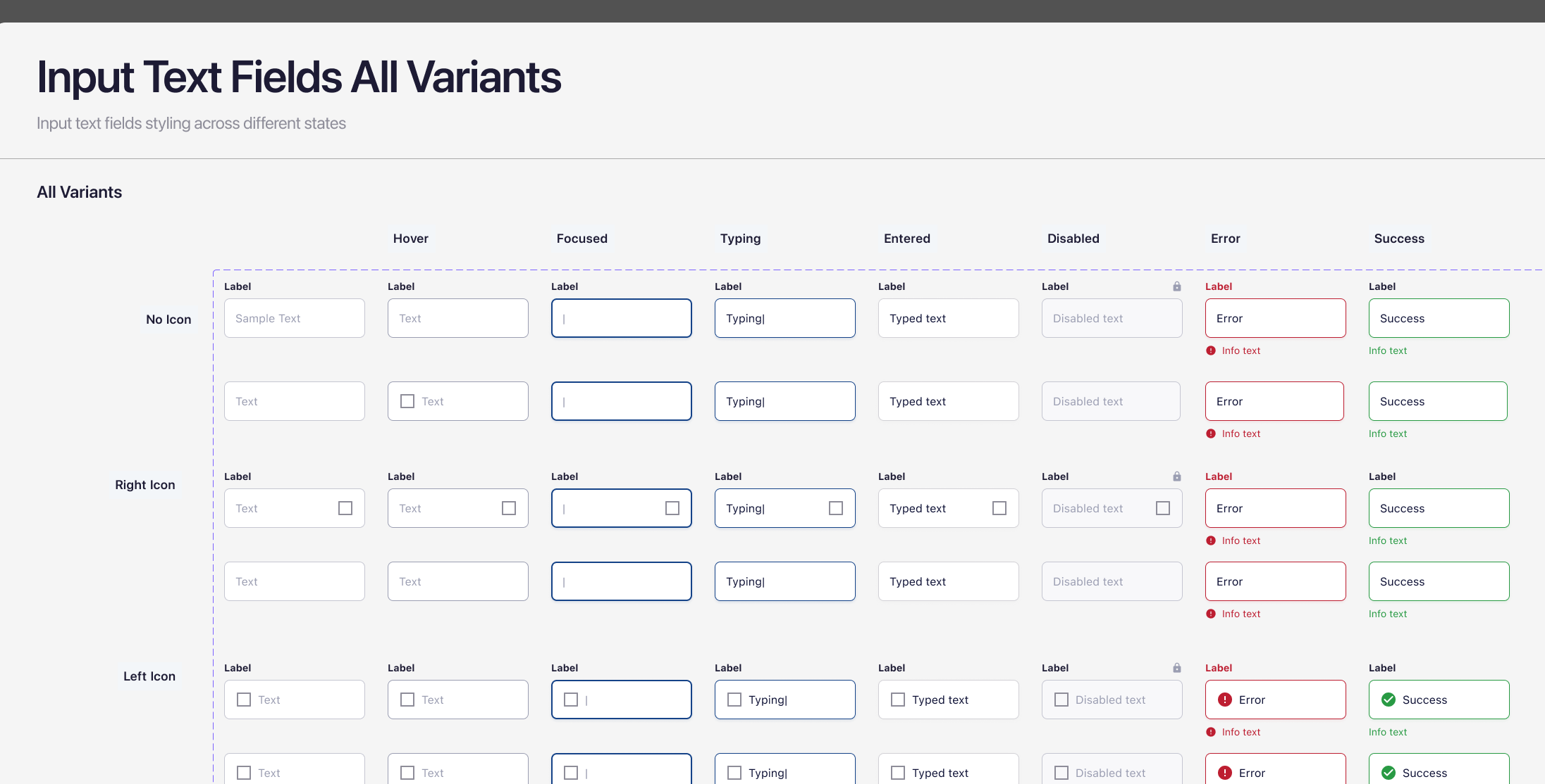
Tamkeen's forms collect sensitive, often legally binding information — IBANs, CPR numbers, commercial registrations — so every field needed seven states defined up front: default, hover, focused, typing, entered, disabled, error, and success. Skipping any one of them is how a form ships that looks fine in Figma and breaks the moment a real person mistypes their CPR.
In practice
Composed form shells
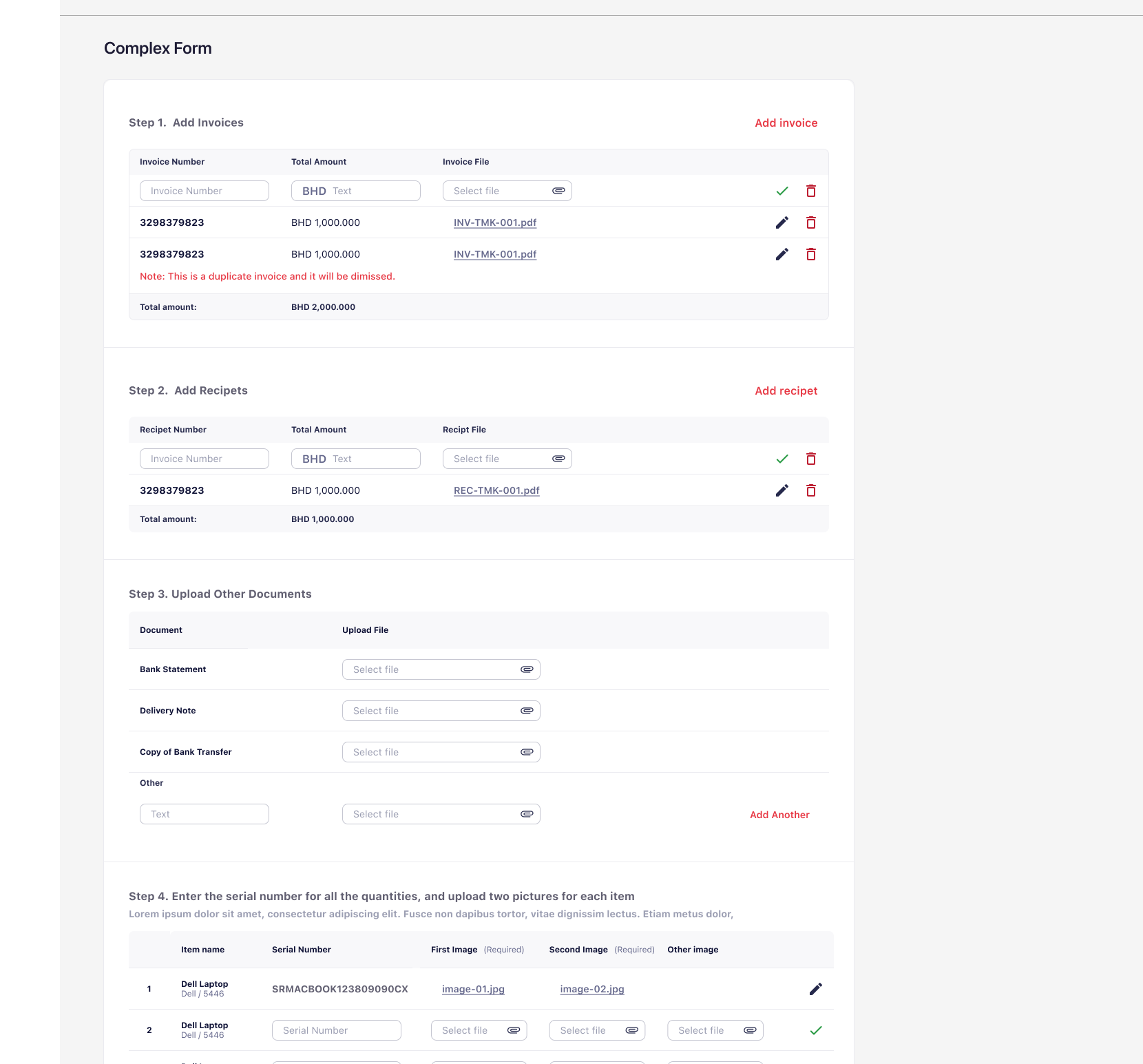
Individual fields are only half the system — the other half is how rows of fields compose into a shell: a header, one or two columns, an optional action row. Every form in the product is one of a handful of these shells with different fields dropped in, not a bespoke layout built per screen.
11Feedback & overlays
Four semantic colors, reused everywhere something needs to tell the user how it went — never a one-off color invented for a single error message.
Modals
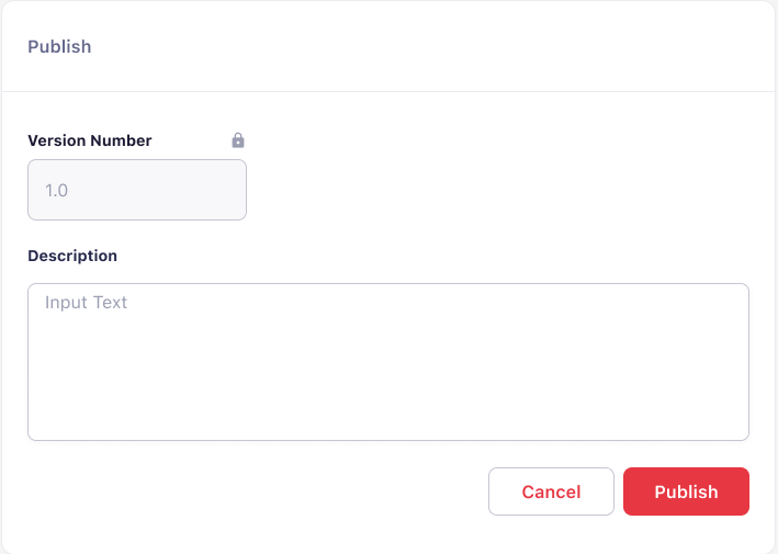
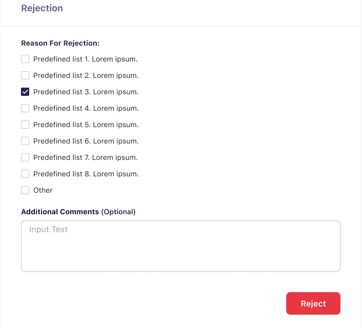
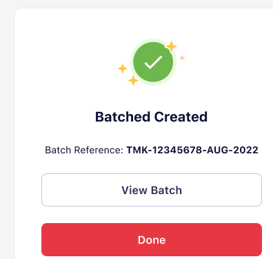
Modals carry real legal and financial weight in this product — terms-and-conditions acceptance, payment confirmation, rejection reasons that feed back into an applicant's record. Each one keeps a single primary action and a clear escape route.
Filter & sort menus
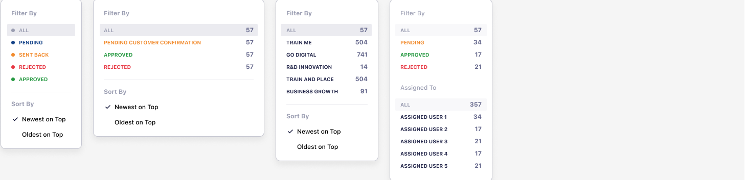
The same dropdown shell handles filtering by status, by category, or by assigned reviewer — only the option list changes. Counts sit inline so a reviewer can see queue size before committing to a filter.
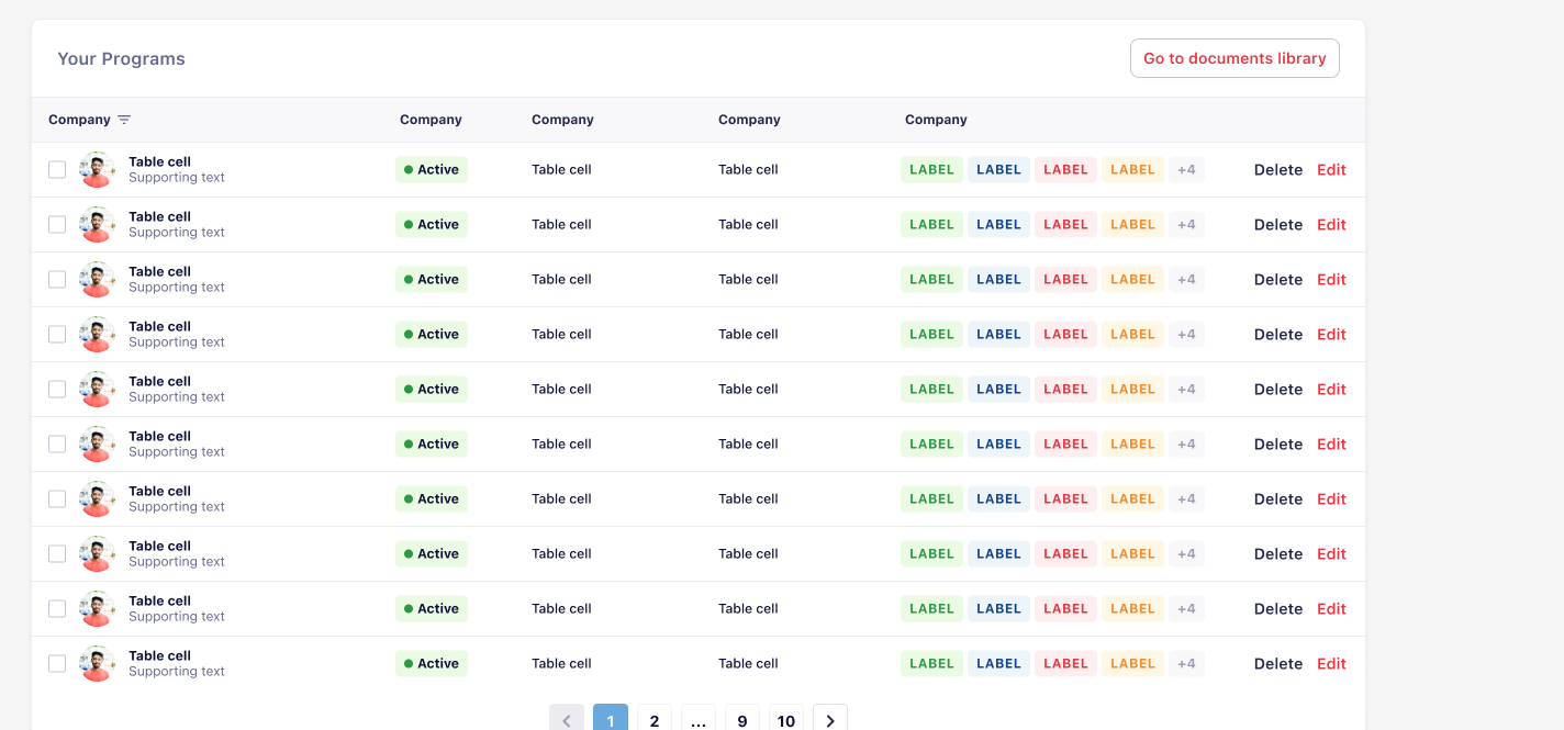
12Data & tables
Most of what Tamkeen's internal team does all day happens in a table: applications queued for review, payments awaiting approval, claims sorted by status. So the table component carries the most weight of anything in the system — row-level status badges, bulk actions, and pagination all had to work together without the table turning into visual noise at 50 rows.
13Navigation & shells
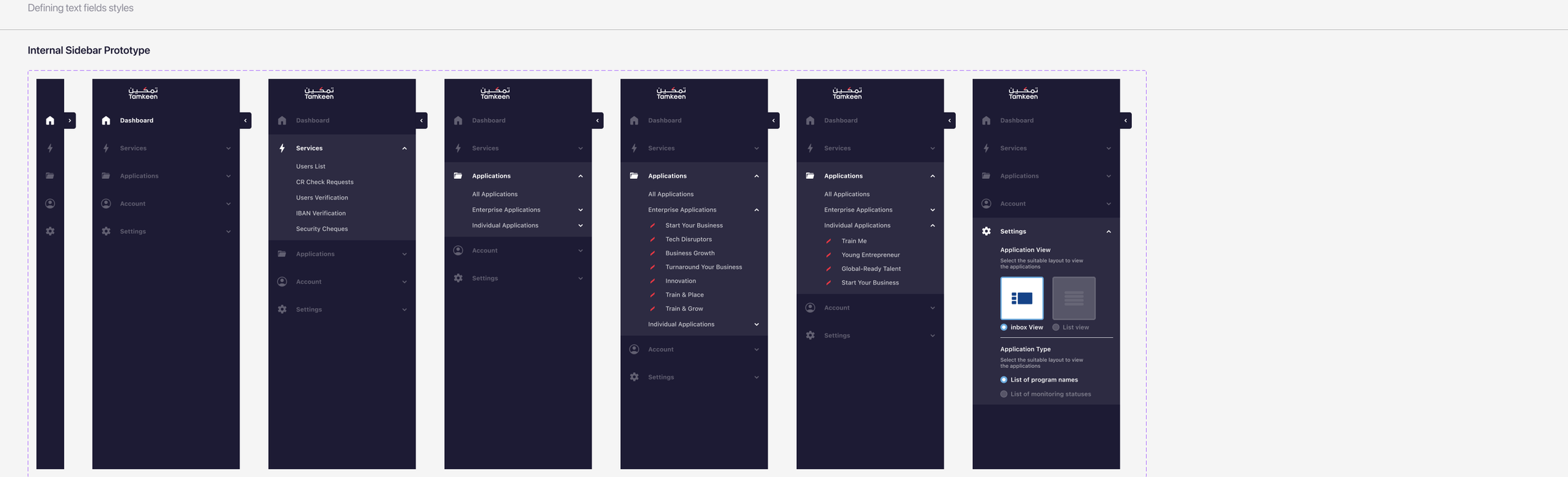
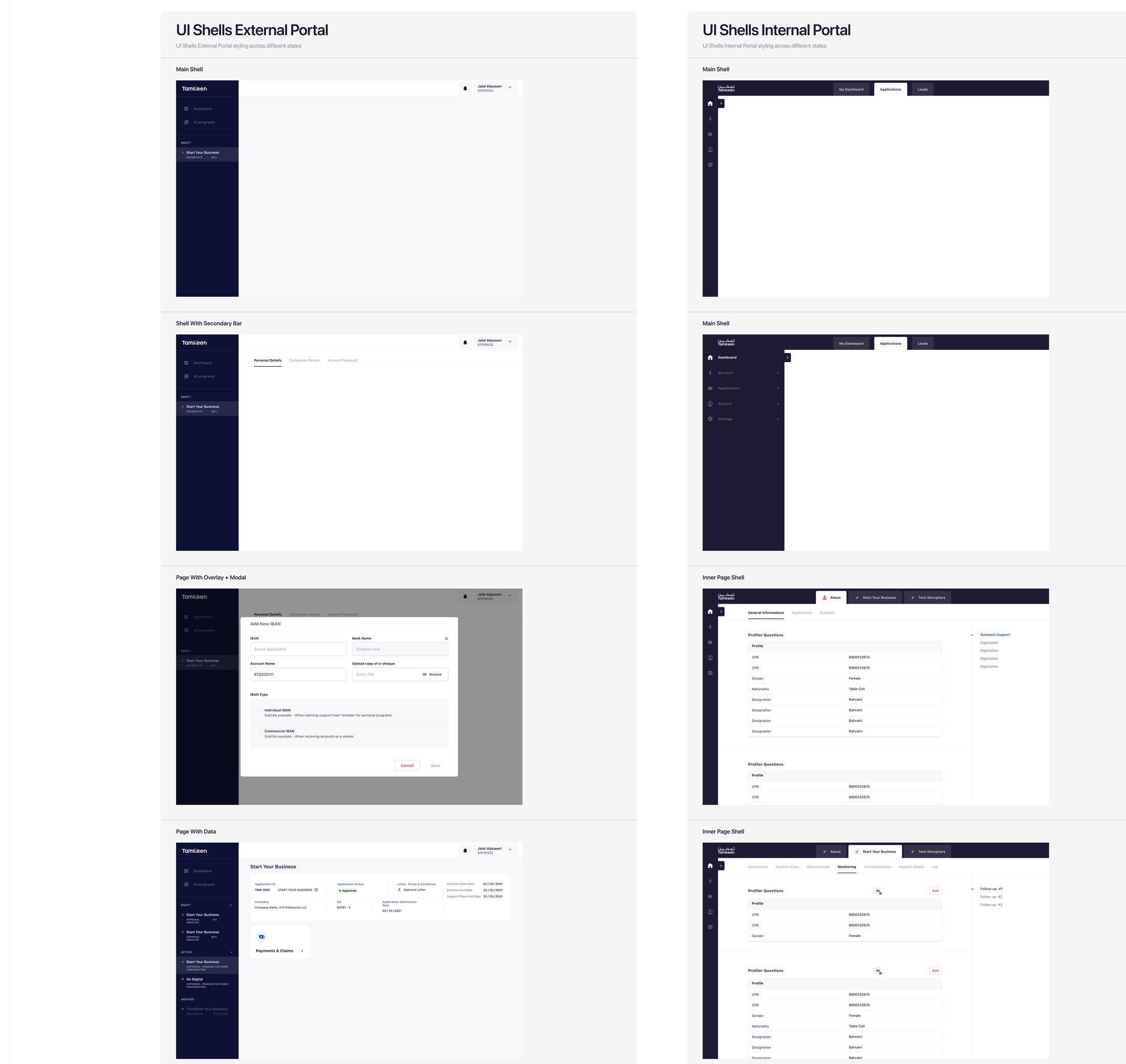
Tamkeen runs as two distinct products under one system: a public portal where businesses apply for programs, and an internal tool where Tamkeen's own team reviews and approves them. Same tokens, same components — different navigation depth, because the two audiences need different things from a sidebar.
Progressive disclosure
The internal sidebar collapses to icons-only by default and expands one section at a time. Reviewers handling dozens of applications a day don't want five levels of navigation permanently open — they want it there when needed and out of the way when not.
External vs. internal shells
The external portal's shell is deliberately shallow — a handful of top-level items, because an applicant only ever needs to find their own programs and applications. The internal shell carries far more: monitoring, support tooling, audit trails.
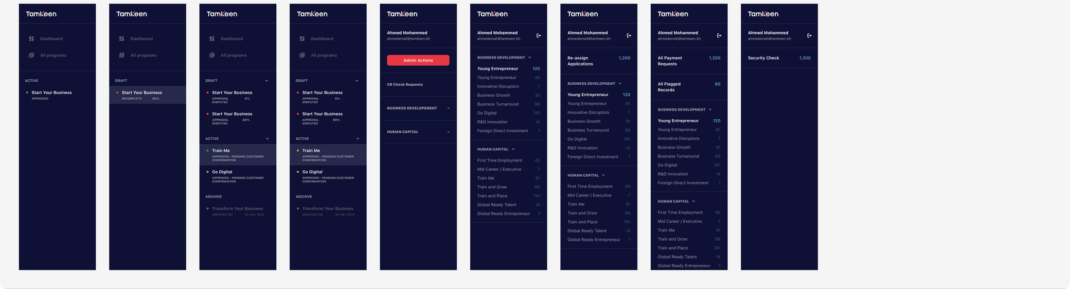
From navigation to a real dashboard
The end state: a branded sidebar holding real application data — draft, active, and archived programs, each with its own status and progress.
14Patterns
This is where tokens and components stop being a library and start being a product. Three patterns below are composed entirely from pieces already shown above.
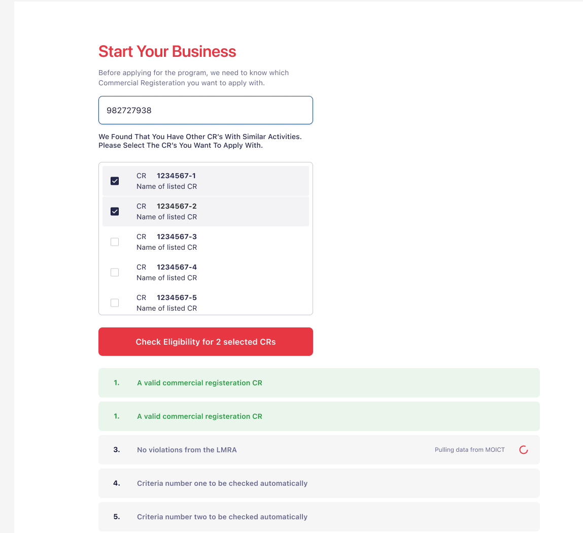
Eligibility check
Before an applicant ever sees a form, the system checks their commercial registration against live government data — pulling from MOICT and checking violations with the LMRA in real time. Every criterion shows its own state independently, so an applicant can see exactly which check is still running and which already passed.
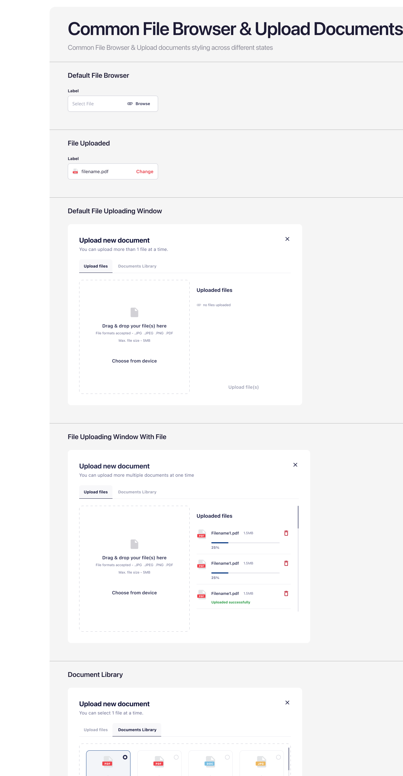
Document upload
A drag-and-drop zone, a per-file progress bar, and a document library tab for re-using a file already on record — the same modal shell handles a single required file or a folder of supporting documents, the same way every time.
Claims & payments
Payment and claim actions reuse the filter-menu shell from section 11 as expandable cards — each one a short label plus a one-line explanation of what choosing it actually does, so an applicant isn't guessing what "Pay Partial Amount" commits them to.

15What's next
Foundations exist so component decisions don't have to be re-argued every time someone opens Figma — and that held up. Every button, badge, and form field in this case study traces back to one of the tokens defined in section 02. The patterns in section 14 are the actual proof: real workflows — eligibility checks, document uploads, payment claims — built entirely from pieces that already existed, with nothing invented at the last minute to make a specific screen work.